Tuesday, July 24, 2007

Book - Pacific Modern

Book
Pacific Modern


Well, after coming across some vouchers for the local book store, this was the logical choice. Fantastic articles, photos and plans for a number of Australian, Kiwi, Singaporean, Malaysian and Thai residences.
Vernacular construction but with the ever modern open plans and expanses of glass.
Hope to share thoughts on some of my readings over this week.


Via: Amazon

Monday, July 16, 2007

Christensen & Co. Arkitekter - Asseribo Home

Christensen &Co. Arkitekter
Holiday Home in Asserbo

This is a real Danish Bach. Located between the coast and Lake Arresø in Northern Sealand (note not New Zealand).


Perfect layout for roughing it at the beach, lake or river. The sleeping and bathrooms are built into the back wall meaning that all the areas that really need to be cosy and not as lit, are at the back. The kitchen takes the eastern (sunrise) wall of the main living area where everyone plays cards, drinks and chats till the early hours where all head off to their bunk rooms.
The Tortilla shell shape means that the rear wall (thermal mass) can temperate the back rooms, while the main living area with 3 sides of opening glass can become a large shaded deck in warm weather, or be heated by the fire in colder temps. By the look of all that glass I'm predicting it's like a 3/4 sleeping bag, you can use it only 3 out of the 4 seasons.


Michelle Kaufmann Designs - mkLotus

Michelle Kaufmann Designs
mkLotus

Well here it comes. MKD's latest work is due to be released in the coming months and on display at a show in the US.


Looks more compact than other versions but still with that Clerestory window action in the living area.

Notes from the West Coast Green
website:

High Performance, Energy Efficient Building Systems Include:
- Green “Living” Roof
- Solar Power: This Home Uses 100% Solar Generated Power
- Rain and Groundwater Catchment System: Collected Water is Used for Irrigation
- Gray Water System: Collected Water from Sinks and Shower is Recirculated to Toilets
- Exterior Siding: Low-maintenance, Long-lasting Integral Color Cement Board by Cembonit and FSC Certified Wood
- Sheathing and Floor + Ceiling Framing: FSC Certified Wood
- Wall Assembly is SIPS (Structural Insulated Panels)
- High Performance, Energy Efficient Spray-in Open Cell Foam Insulation by Icynene
- On-demand Water Heater Provided by Noritz
- Energy Efficient HVAC System
- Double Pane, Low-E, Wood Windows and Glass Doors with Aluminum Cladding by Sierra
- Double Pane, Low-E, Wood with Aluminum Cladding Folding Glass Door Walls by Nanawall

The Interiors of this Beautiful, High Performance Home Feature:
- Sustainable Layout for Maximum Cross Ventilation and Natural Lighting
- Rapidly Renewable Bamboo Flooring
- No-VOC Paint by Yolo throughout
- LED Lighting throughout
- Interior Sliding Door Panels by 3form: EcoResin comprised of 40% Post-Industrial Reclaimed Material

Eco-friendly Kitchen Features:
- FSC Certified Wood Cabinetry (over Roseburg Skyblend Particleboard)
- Countertops by Concreteworks: Fly Ash Concrete, Rice Hull, and Recycled Porcelain Aggregates
- Eco-friendly/Low-Flow Plumbing Fixtures by Kohler
- LED Lighting
- EnergyStar Appliances

Eco-friendly Bathroom Features:
- FSC Certified Wood Cabinetry (over Roseburg Skyblend Particleboard)
- Countertops by Concreteworks: Fly Ash Concrete, Rice Hull, and Recycled Porcelain Aggregates
- Floor and Wall Tiles by Terra Green Contain 55% Recycled Glass
- Eco-friendly Plumbing Fixtures, Low-flow Shower Head, Mixer, and Dual-Flush Toilet by Kohler
- LED Lighting

Off Site Modular Technology Results in 50% - 70% Less Waste than Traditional Site Building.
Fish & Chips: Floor plan 2br PDF
Via: Michelle Kaufmann Designs, West Coast Green

Tuesday, July 10, 2007

Kitchens

My thoughts on the heart of the house


I think the focal point of most homes, irregardless of the house layout tends to be the kitchen. It’s the one room (like the bathroom one hopes) that you’ll visit at least once a day. Hence the attention to detail and layout in kitchens deserves the effort companies are putting into it. Little things like correct sink height for end of day washing up, to handy storage of oils and spices by the stove, can make all the difference.


Delving through from a link on Mocoloco today revealed the Arclinea Mediterranean range.

This little number, pictured, with a central preparation bench leading to an in-kitchen dining area is great. The preparation triangle is a little stretched - I can’t see the fridge but the larger layout works for me.

Ideally there should be a preparation chain from fridge, to basin, to chopping board, to stove or oven. In the above, that would place the fridge beside the sink on the right. The final prep before cooking area faces out to the table where everyone not helping congregates.

For me, the ideal chain is streamed into two.
1. Fridge, to basin and peeling area, to chopping board, to stove or oven
2. Fridge, to microwave, to chopping board, to stove or oven
This meaning that the chopping and cleaning area need to be side by side.


As cooking is a performance, when entertaining guests and flipping pancakes, the stovetop should be facing the table as well. The fridge, microwave and oven play minor roles in terms of attended time, placing them behind the performer, within reach, would be best. The above design shows a clear path from fridge, to chopping board, to stove, all whilst facing guests, or children playing at the table. The rubbish bin and dishwasher fit under the sink, along with pots and pans within easy reach of the stove and prep area with the plates and glasses in side units along the wall. Also, from waiting on the right side of the table, leaning back, you can peek at the oven.


Technically, hafting to pipe water, gas, extractor and electrics in to the centre island is costly and difficult, but I think worth the effort. Ideally the wash, chop, cook setup would be reciprocated outside with the BBQ, yet against a wall for the BBQ flue.


I’m not sold on ovens or microwaves being above waist height as they’re hard to lift in and out of. I do however like the idea of a double door fridge freezer and to top it all off, the must have - a large plasma screen TV - on the wall at the far end of the table, perfect for all to watch and out of the way.

Links: Arclinea

Monday, July 9, 2007

Michelle Kaufmann Designs - Breezehouse & Sidebreeze

Michelle Kaufmann Designs
Breezehouse & Sidebreeze

Michelle Kaufmann Designs and their sister company mkConstructs produce IMHO some of the best prefab home designs around. Real attention to detail in the whole design floor plan, use of materials and emphasis on environmentally sound construction.


Sidebreeze


Breezehouse

They’re Green
Rather than masses of fans and electric heaters, passive heating and cooling via breezeways and solid floor thermal masses for heat gain. They act like big warmth storage units, heating up during the day for release at night. Not to say at extremes the house would not require help, but the designs are really ‘sun focused’, cutting the assistance required. Being brought up with the windows and doors open all the time in summer, I can relate to a house that’s designed to let a breeze flow through, something that all houses in Brazil and northern New Zealand could do with.

The floor plans are simple with very few wet walls. With all of the mechanical, water and plumbing centralised, costs are cut and things are simpler to put together in the final install of the units. Green timber (renewable source) is used, water-saving plumbing fixtures, on-demand water heaters, and a mechanical ventilation system that is 30% more efficient than typical forced-air systems.

Flat roofs could easily accommodate solar panel arrays and water collection.


Quick
From what I can see, very little bar concrete floor pads and perimeter walls is construct onsite, leading to great efficiencies in terms of labour, less waste materials and reduced emphasis on onsite project management. Time is taken in offsite construction and design consultation. The other bonus of having everything built offsite in a warehouse is that weather delays are reduced.


Favourite designs
To be honest, they’re all great and suited to their purpose. Their product range provide solutions that fit most sites.My wife, who’s keen on having bedrooms upstairs away from the noise (and perhaps with them up high she feels more secure), likes the
Sidebreeze.
The floor plan for this house is great, presuming the house is orientated correctly; the kitchen can have all day sun, as can the master bedroom. All rooms have opposing windows that allow airflow across the room and have natural light. Those that require less light are in the core of the house: bathrooms, end of kitchen, mechanical and laundry areas. Clerestory (I love that term) windows are a feature in the living/dining rooms too. These let winter sun in when it’s most needed to heat up the thermal mass floors.

I’m partial to the Breezehouse, as I love the idea of being able to get outside from every room. The layout leads to two small courtyards, easier to handle for the novice gardener and although being one level, the house and courtyards seem to create a secure area for kids to play in, although the having so many doors to lock would worry my wife

Many of the features found in the Sidebreeze, designed for narrower lots, come from the Breezehouse. So the same Clerestory windows, breezeway, central core plumbing, thermal mass flooring, open light feeling are in this design. What are also nice about both designs are the minimal external windows. With lots becoming ever smaller and neighbours ever closer, it’s nice to see that the house’s windows are introverted. Larger spans of glass look across the property rather than out to the neighbours.


Both designs would suit a ‘south facing view’ type lot as well. This is where I can see the many doors of the Breezehouse leading out down to the river or beach and the master bathroom’s external door getting use when arriving home sandy.

Also in their quiver are the original Glidehouse and the new mkSolaire designed for views and even tighter urban lots respectively.

I cant wait to see what their next design will be.

Friday, July 6, 2007

Urs Peter Flueckiger - House on 21st Street

Urs Peter Flueckiger
House on 21st Street (NYTimes)

Good so see an economical house built on a very tight buget, that's still great to live in.


NyTimes Article:
By PAIGE WILLIAMS
The first thing to know about the house Urs Peter Flueckiger built is that he did it for the startlingly low price of $51 a square foot, $50.87 to be exact, by using the kind of bulk metal siding usually associated with airplane hangars and toolsheds. The second thing to know is where he did it: here in the high plains of West Texas, one of the flattest, starkest, most sun-seared places on earth.

The land around Lubbock is so flat you can see every steeple, every water tower, every truck kicking up dust a mile away. On a clear day the sun burns like a klieg light, with little vegetation to filter it. Mr. Flueckiger likes to say West Texas is 80 percent sky and 20 percent earth.

As you might guess, Flueckiger (pronounced FLOO-kigger) is not a good old Texas name. Mr. Flueckiger — known as Upe (OO-pay) — comes from the Swiss Alps, about as topographically opposite the high plains as one could imagine. He arrived in Lubbock by way of Lugano, where he worked with the architect Mario Botta; Manhattan, where he worked as an architect for David Rockwell; and Blacksburg, Va., where he earned a master's degree in architecture at Virginia Tech.

To celebrate the completion of his master's, Mr. Flueckiger treated himself to a trip to see the work of the late Donald Judd, the minimalist art pioneer who lived in Marfa, in deep West Texas. As it happened Texas Tech University, in Lubbock, was looking for an architecture professor at the time. Much as Mr. Flueckiger loved his Upper East Side apartment and the nearby museums and gliding through Central Park on his Rollerblades, he loved Judd more. In the fall of 1998 he began teaching at Texas Tech and making six-hour treks to Marfa, to begin what would become seven years of sketching Judd's art and architecture. (This fall Birkhäuser will publish the drawings in book form.)
Judd's work electrified Mr. Flueckiger, especially in the context of the landscape: vast cotton fields and bobbing hobbyhorses of scattered oil rigs and unpretentiously handsome warehouses and cotton gins of corrugated steel. "As a newcomer to this area I don't bring associations of hardship and work with these particular rural industrial buildings," he said.

Then came another pleasant development. An art professor and painter named Carol Fitzgerald worked on his floor at the university. As Mr. Flueckiger likes to say, "We found love in Lubbock." The artist and the architect married in 2001 and soon started looking for a house.

Lubbock, like everyplace else, was growing suburbs. New home construction was pushing the city west. The Flueckigers preferred Tech Terrace, an 80-year-old neighborhood opposite the university where houses generally sell for $50,000 to $300,000 in a menagerie of styles. They considered moving into an existing home or renovating one, but then Ms. Flueckiger basically said, You're an architect — design something.

"In academia research is such a big part of being a professor," she said. "I just thought, Let's push it. It's a project." As Mr. Flueckiger put it, "Because we love modernism, this became a laboratory."

They bought and demolished a dilapidated 800-square-footer, leaving a lot 50 by 150 feet. Mr. Flueckiger chose to build with industrial materials in homage to the region's history but also to prove that it was possible to create an affordable, durable house that was beautiful and interesting to live in. He began envisioning his design as an alternative to modernist prefabs, many of which sell for about $250 a square foot.

Mr. Flueckiger knew he could design a family home for considerably less, without compromising the design. Painted corrugated steel (more expensive than galvanized but certainly less blinding) cost about $2.50 a square foot. Concrete poured on the site ran about $3.50 a square foot, which included the foundation footings beneath the slab. Sliding glass doors with insulated float glass cost $510, including screen and installation.

Mr. Flueckiger first designed a two-story house with a wall of windows and 15 skylights. He and his wife — who has long experimented with color and texture in her own work — chose to paint the cladding red because it contrasts, rather than competing, with sky and grass.

But this was Texas. Corrugated metal is for the farm, not the family. And two stories? And red? The contractors weren't wild about building such an experimental house, and some neighbors weren't wild about their building it. Yet Mr. Flueckiger met the most resistance from Ms. Flueckiger, regarding the rising cost. As they like to say now, just because you're a two-income family doesn't mean you should spend like one. Mr. Flueckiger had to redesign.
"My dream shattered," he said. "Then my wife brought me back to the ground and said: 'Well, look, you're creative. Why can't you design within the budget?' "

In a day's time Mr. Flueckiger designed the house the Flueckigers now share with their 3-year-old son, Lucas. They saved money by reducing the house to one story and cutting half the windows, and by using wire racks and metal footlockers instead of built-in closets, maple kitchen cabinets without hardware, and kitchen countertops of white plastic laminate instead of granite or tile. The furniture Mr. Flueckiger made himself: floor lamps of rebar and twine; a work desk of glass and welded steel; bookshelves, tables and chairs of sturdy blond Baltic birch plywood finished with tung oil, if finished at all. (These call Judd's furniture to mind, with whimsical variations and cutouts.)

Together the Flueckigers designed a signature piece: a coffee table of his woodwork and, beneath a layer of glass, her embedded painting. (They have since added two Hans Coray aluminum patio chairs, a Botta Seconda chair, a tomato red Karlanda sofa from Ikea and a set of 1960's Eames fiberglass chair shells that they had retrofitted by Modernica.)

From the street the house has a low profile. Alternating bands of concrete block form the facade; the house stretches directly back, like a railroad apartment. "You really don't know what's going on in this house until you enter," Mr. Flueckiger said.

From the foyer the view shoots the length of the house. Three bedrooms and two and a half baths are flanked symmetrically by Ms. Flueckiger's art studio on the north end and Mr. Flueckiger's design studio on the south, all bracketing the courtyard. ("My wife says it's like a Swiss Army knife.") The first and lasting impression is one of playful comfort and warmth, of intimacy yet spaciousness, the collaborative results of Mr. Flueckiger's architecture and Ms. Flueckiger's art.

Ms. Flueckiger balanced the minimalist design with unexpectedly graceful whimsy. In the foyer and living room she painted the dominant wall apple green. With leafy limbs from a nonfruiting mulberry outside their newlyweds' apartment she created a pastel silhouette on two highly visible interior doors, infusing softness and emotion. Her weather-themed paintings spiritually connect to the courtyard. Even the smooth concrete floor, with a chemical sealer to repel moisture, echoes Ms. Flueckiger's influence with natural traces of blue, as in marble.

The centerpiece is a loftlike living space and kitchen, separated from the courtyard by five sets of sliding glass doors and clerestory windows. The sliding doors open beneath a bamboo and steel pergola and onto a grassy patch of pecan trees, Japanese-inspired rock beds and a cedar fence where the Flueckigers plan to plant black bamboo.
"Those long, tall windows bring in the comfort of the grass," said Tina Fuentes, who is interim director of the Texas Tech art school and has visited the red house. "With the volumes of sandstorms we have in West Texas, when you have carpet all this stuff gets trapped in there and you find yourself cleaning constantly. And on the issue of heat, what a nice feeling to be able to move barefoot from the grass to the coolness of the concrete, that transition of texture." (The house is heated and cooled by a forced-air system fueled with electricity.)

It's in the conjoined living space that the house feels particularly alive. Light plays across red ridges, through bamboo slats and tree limbs like a slide show of shadow.

"It's a very sensitive house," Mr. Flueckiger said.

It was a weirdly frigid West Texas morning. A mad and wrenching wind moved unfettered across the high plains. But inside the red house Lucas was in sock feet with toys on the living room floor, playing by the light of the courtyard and the lamps his father made.


Via: NYTimes, MocoLoco

BP Architectures - House Like a Village

BP Architectures
House Like a Village

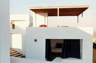
Translation - In co-operation with his partner Jean Bocabeille in Paris offices "BP the Architectures" developed the idea. Instead of creating a large volume, why not produce an ensemble of several small cubes, which relates skillfully to Greek regional building traditions with modernistic style. The result: Six lime-white cubes, which group themselves like a tiny village around a central court.


Fish & Chips

Via: Haeuser

Crosson Clarke Carnachan Architects - Coromandel House

Crosson Clarke Carnachan Architects

Coromandel house
Looks like Arkinetia have beaten me to it, posting one of my favourite New Zealand houses.
A real Kiwi Bach!


The house was conceived as a container sitting lightly on the land for habitation or the dream of habitation. The intention was to reinterpret the New Zealand building tradition - the crafting of wood - the expression of structure, cladding, lining and joinery in a raw and unique way.

The construction is reminiscent of the "trip" or "rafter" dams common in the Coromandel region at the turn of last century. Heavy vertical structural members supporting horizontal boarding. The unadorned natural timber, a sustainable land renewable resource, provides a connection to nature and the natural. A simple mechanism to the deck allows the "box" to open up on arrival - providing a stage for living - and to close down on departure - providing protection.

The house has a simple rectangular plan that sits across the contour in a patch of cleared bush in the manner of the rural shed, facing north and the view. The living room is open to the outside and the sun, a metaphorical tent or campsite, while the bunkrooms are enclosed and cool. The large fireplace allows winter occupation and the open bathroom and movable bath allows the rituals of showering and bathing to become and experience connected to nature.

This bach is an attempt to provide an environment to capture the essential spirit of the New Zealand holiday in the New Zealand landscape.


Worldarchitecturenews.com PDF
Via:
Arkinetia
CoolBoom
worldarchitecturenews