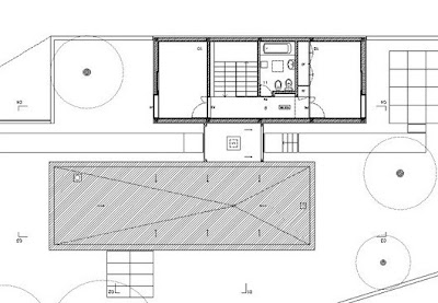
Casa Milhundos
This place is another on my list of great layouts.
Taken from Arkinetia - (Thanks for the dig last week on your blog!!)
Admittedly it looks a little plonked into it's surroundings, but it does have the solar gain sympathetic layout, that I'm into and the pristine white rear structure seems "protected" by the rough black box in front.
Taken from Arkinetia - (Thanks for the dig last week on your blog!!)
Admittedly it looks a little plonked into it's surroundings, but it does have the solar gain sympathetic layout, that I'm into and the pristine white rear structure seems "protected" by the rough black box in front.

Moving through the house in a South - North direction the front one story slate/dark stone covered box contains the living and dining/kitchen areas. below this box is a huge cellar the length of the building. Moving back, through the entrance foyer, you arrive at the stairwell, wet wall with toilet beside the staircase, and a bedroom either side of these. This is repeated upstairs. The daytime and nighttime areas are separated and the Master bedroom could be upstairs away from it all.
It's very minimalist, no doubt in response to the brief, but I think I'd like to open it up a little more to the light (perhaps with shutters to deal with the summer heat). I really dig the separate function of the two units. It'd work well with a south orientated coastal setting as all but one room could have sea views and sunlight from the south facing windows (which could be remedied via a picture window looking through the living room).
The contrasting black and white units also appeals. The use of black is something I've admired in a lot of houses, predominantly wooden numbers from New Zealand, see - Andre Hodgskin Architects Paihia Bach. But my concern is how do you keep the planks on the house? The number of times I've seen black wood warp in the sun and rip itself off a fence or house........ But slate, that's a different story and must make these front rooms SO cozy in winter, and the patio in the same material, great.


From their site:
The plot is located in the outskirts of the city of Penafiel, in the valley of the river Cavalum in an allotment near the park of Quinta das Lages. The proposal modifies the implementation anticipated in the original allotment and resumes the duplication rule, not observed in the buildings of the lots L8 and L9, seeking a more articulated solution with the nearest volumes and simultaneously taking the vast ambiguities and disarrangements between the allotment and the lot drawings into account. As for the house itself, it is organised in two functional, though complementary, autonomous groups, to which correspond two distinct volumes. Each one of these volumes has a different orientation to the space outside: one white and plastered seeks the most distant landscape; the other one, made with dark stone has a more direct contact with the surrounding lot.
Via: Arkinetia & europaconcorsi.com